
Beauty Magazines have some of the best Typeface options. They appeal to your sense of fashion and beauty. The draw you in, quietly saying, “pick me up, I will call to your feminine and creative side”. When we do pick them up we find so much more than what is on the cover. But let’s be honest, would we even open the book if it didn’t appeal to us in some way? The typeface used in this example is one of many that understands the use of typeface and how to draw your customer in. This Vogue Magazine with Kim Kardashian is her 7th time on a cover of a Vogue magazine this time on Vogue Taiwan, published by CONDÉ NAST PUBLICATIONS.

Vogue is known for their Modern Signage. They print it in Bold and Black letters so their readers don’t have to look far for their fashion fix. Along with being stacked full of amazing and colorful ads, Vogue is one of the leaders in fashion advice and their covers never disappoint.
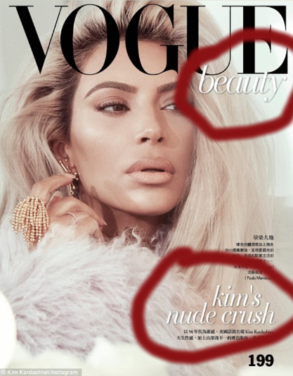
To contrast the black, modern, trademark name, they place a simple word in a beautiful script- written in white ink. It contrasts the name but also draws your attention to the model (Kim Kardashian) on the cover. They continue the script type at the bottom left of the magazine with the highlight of the magazine and it’s cover model.

Both of these are eye popping and contrasting to draw in the interest of all those that look at this magazine cover. Without all these designs together, the magazine might seem like a simple picture with little interest for the reader. The Magazine’s interest is to create an interest- not only in the magazine purchase, but also to entice those who read this to trust the sources within. Each sponsor who enlists their ads in this magazine knows that they will always be seen by many readers because Vogue never disapoints!
